Folk & Flora
Folk & Flora is a new sub-brand launched by the beloved Vancouver-based floral shop Celsia Floral. Studio Verb shaped its brand identity from ground up, starting with making up an appropriate name to the inception of its logo and creating the packaging for its main product.Branding, Packaging, Illustration, IdentityNAMING + LOGO
We helped built the identity of this brand from scratch, starting with the naming development. After sieving through various botanical names, we settled on "Folk & Flora". Meaning "human" and "flowers", Folk & Flora is a gift from nature to all mankind and womankind. We felt this was a fitting representation of our client's product, as they intend on launching succulent gift boxes for this new brand.
PACKAGING
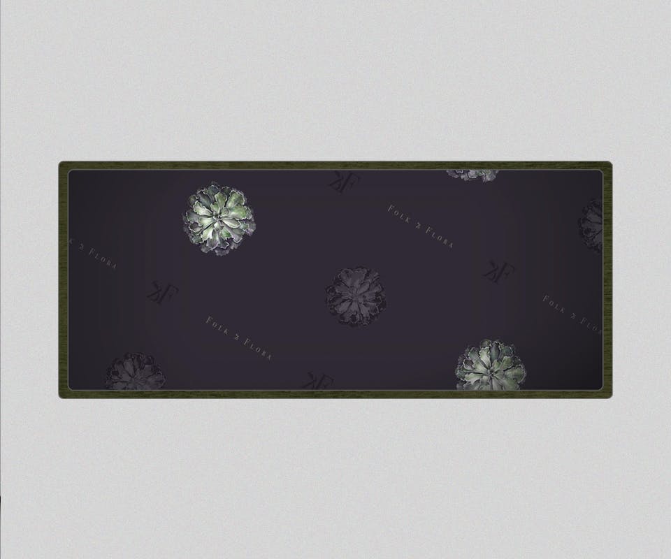
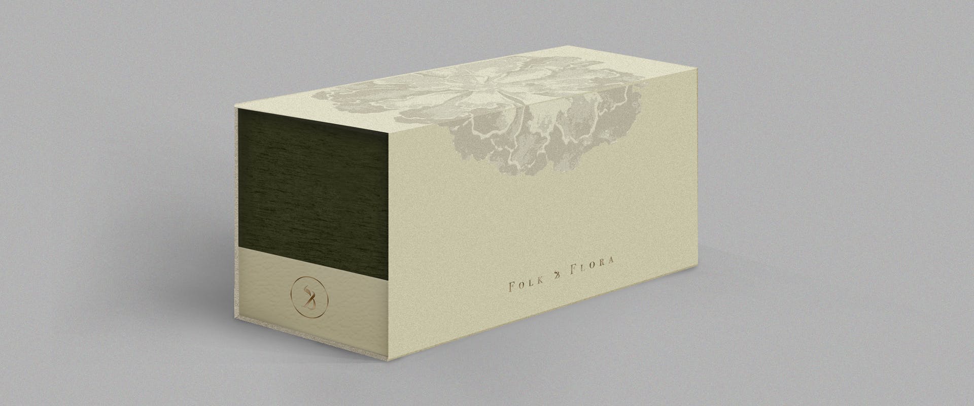
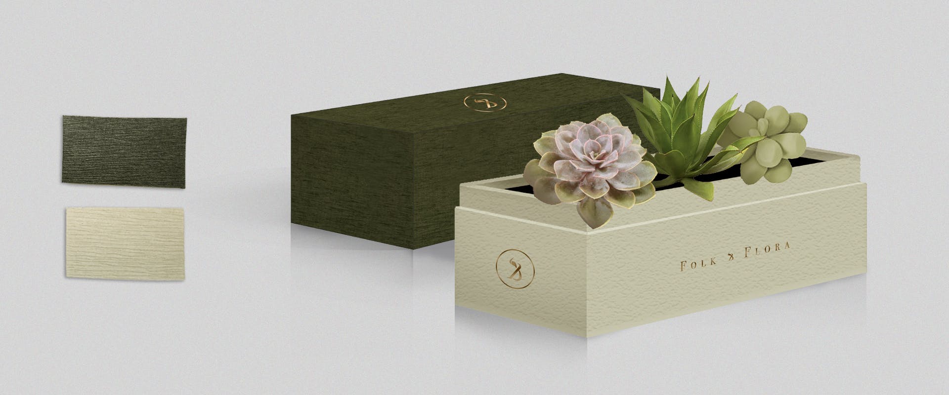
For Folk & Flora's succulent gift boxes, we designed a simple packaging wrapped in French crepe paper. The brand's logo and monogram are stamped in foil on various locations. We also decided on olive green, cream, purple and gold as the brand colours.
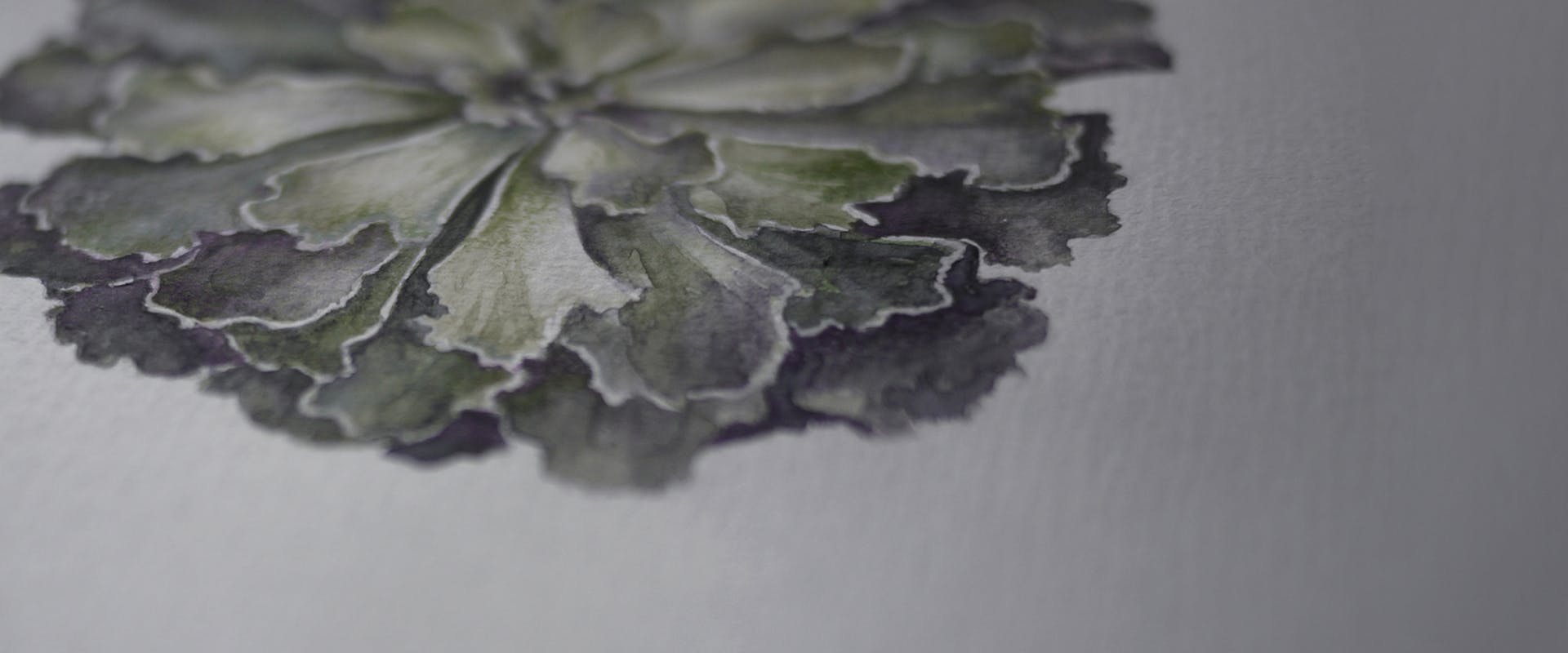
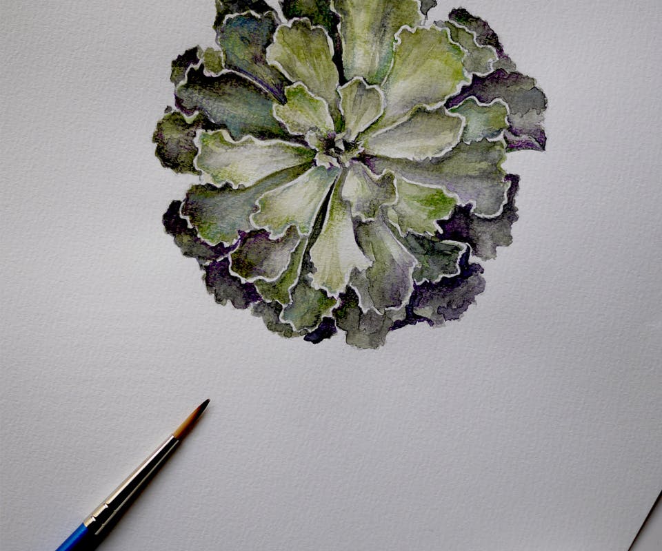
ILLUSTRATION
To enhance the natural and handcrafted aspect of the product, we painted a custom illustration for the packaging with watercolours. The subject of the painting was — unsurprisingly — a succulent in the brand's olive and purple shades. We applied this floral likeness onto the sleeve, as well as the inside lining of the box.