ABTea
https://abtea.coABTea is a tea brand that focuses on slow living and community. They are a Hong Kong based company that sources naturally cultivated tea from all around the world.Branding, Packaging, Illustration, PhotographyLOGO
The logo design of ABTea encompasses the creative vision of its founder. Our client envisioned a brand that reflects the community aspect of tea drinking — an activity commonly carried out for the sake of conversation and sharing. The founder's own name sounds like the Chinese character for "fish", and requested for a monogram that infuses her spirit animal with her product. Taking both ideas into consideration, we sketched a fluttering design that resembles both a wavy fish tail and a floating tea leaf. This graphic swirls in a circular vessel, composing the ABTea monogram.
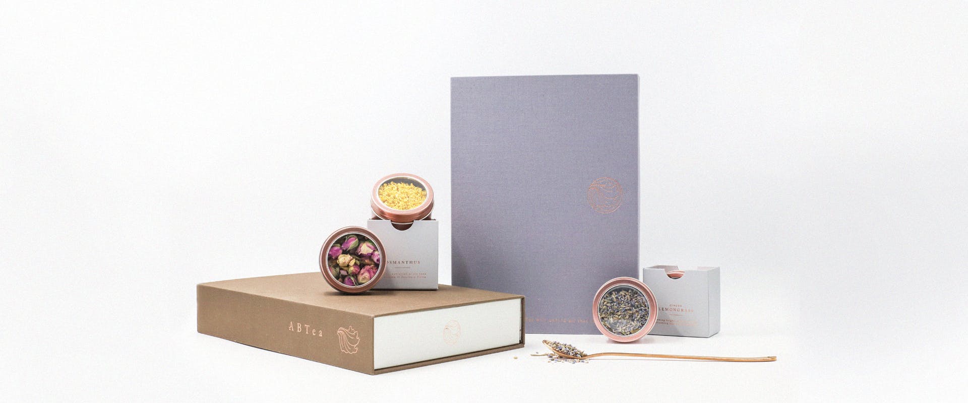
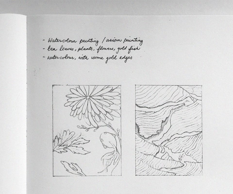
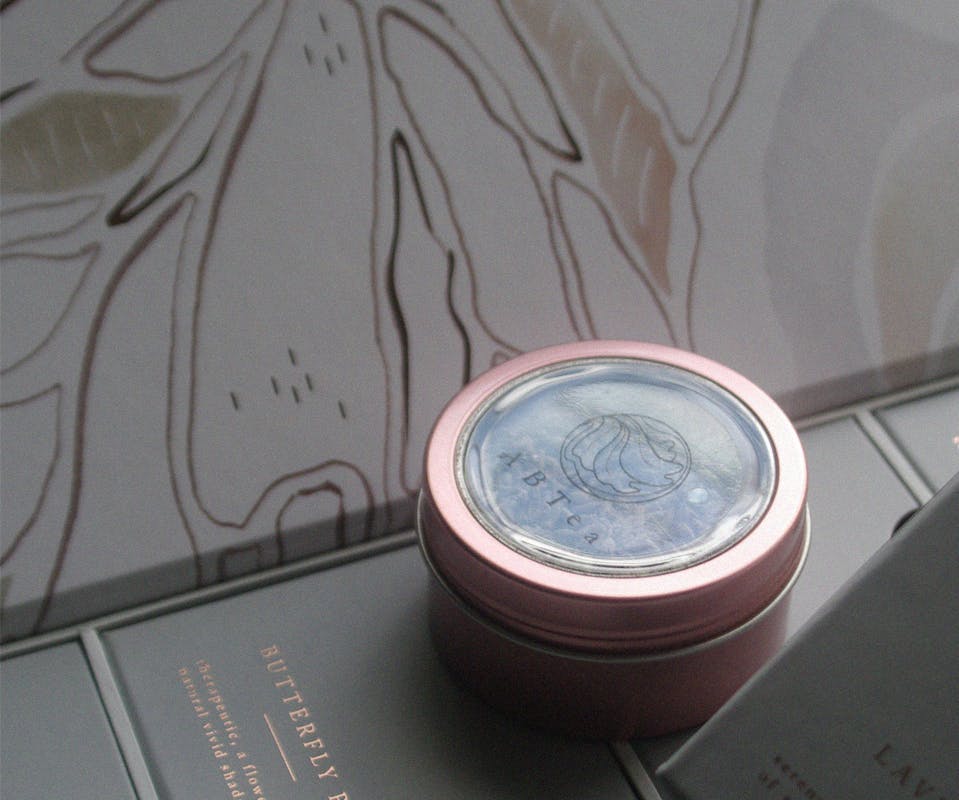
ILLUSTRATION + Packaging
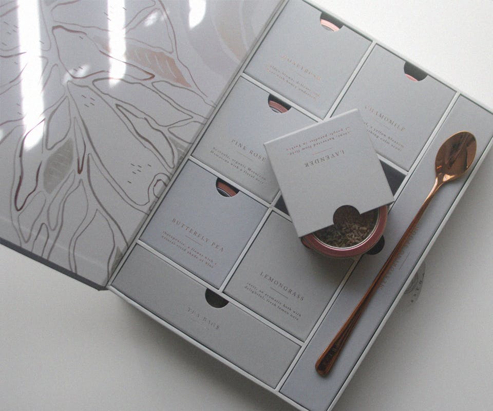
The client had a unique idea to create a "tea book" to enhance the concept of sharing tea. From this, we designed their packaging. The book is wrapped with a premium linen, and a custom illustration we painted was applied to its inside cover. Six cube drawers showcases different flavours of tea, while two longer drawers hold a copper spoon and additional tea bags.